
Proving product-market fit
The goals
Discovery—is this the right next move for Better?
Lower cost of ad per application
Capture emails
Should you refinance?
I worked with our loan consultants to turn the conversations they typically have with potential refinancers into a digital experience.

I grouped all the answers every user would answer together so we could identify problematic drop-off questions faster. From there, the questions branch out according to a user’s response until we ultimately provide guidance on whether or not they should refinance.
Testing the prototype
Because our timeline was tight, we got feedback from our sales and customer experience teams on a mid-fidelity prototype.

We focused our first two questions on a user’s knowledge base. In conversations with users, they often described the process as overwhelming. The results page needed to meet users at their comfort level and encourage them to move forward.

Getting to the heart of why a user wanted to refinance was key. People don’t want to refinance for the sake of refinancing; they do it to get money out for their kid’s college, to pay their loan off faster so they don’t have the burden of debt, to avoid an adjustable rate, etc. How a user answered this question determined what questions they were asked later in the process.

We needed to collect basic information about their current mortgage—origination year, rate, balance—to help a user make a decision. Initially we were worried users would not have this information at the ready, but we found that was not the case with folks looking to refinance.
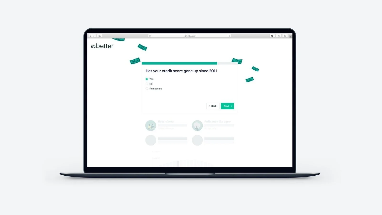
We dynamically populated the mortgage origination year so that users felt this experience was tailored to them.

To determine intent, we asked users if they would be ready to refinance within the next month.
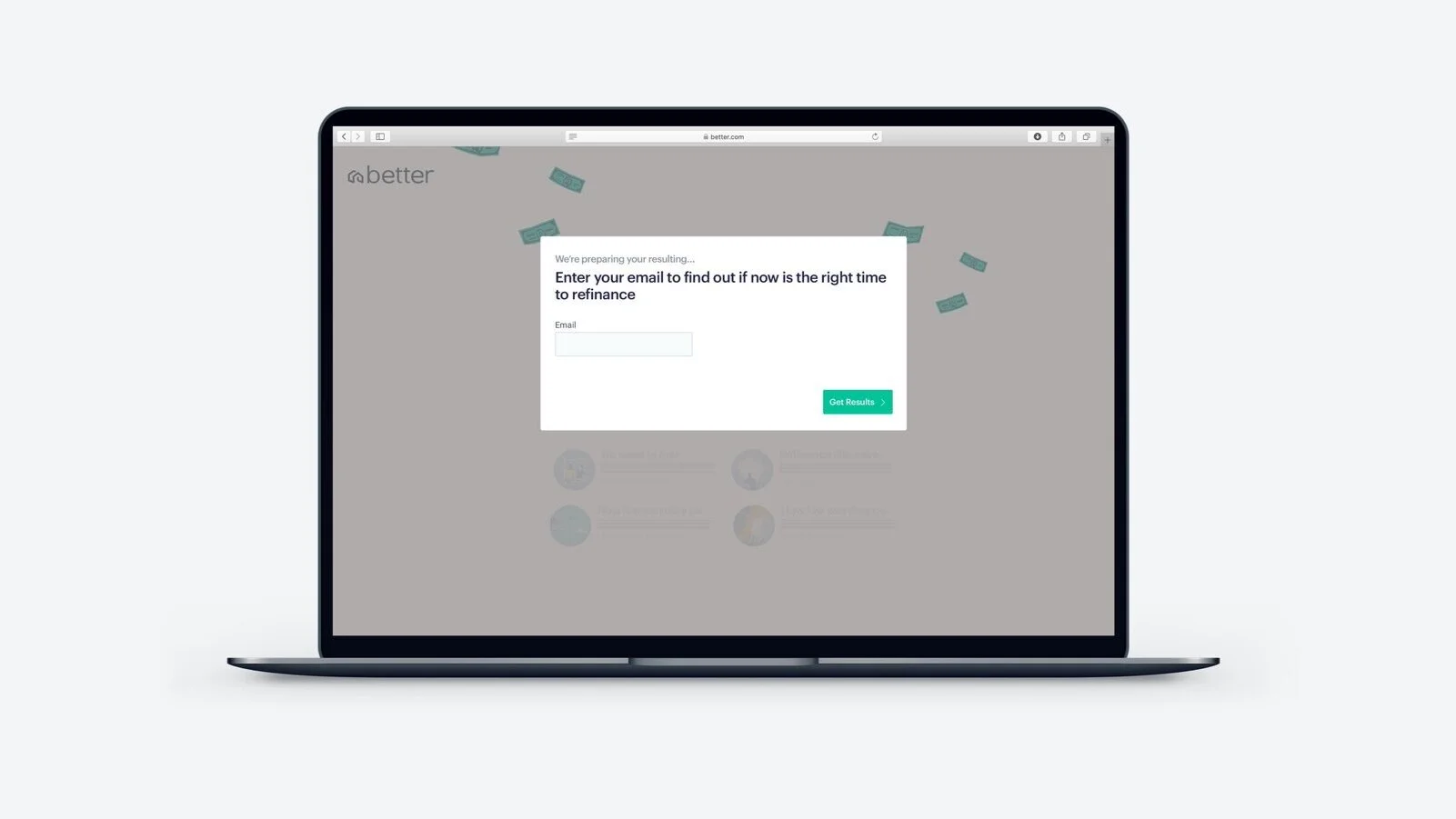
After discussions with marketing, we gated the results with an email capture. We did, however, decide not to validate the email; no matter what email a user put in, they would advance to the results, the hypothesis being that some people would need to see custom advice we provided before sharing their information.

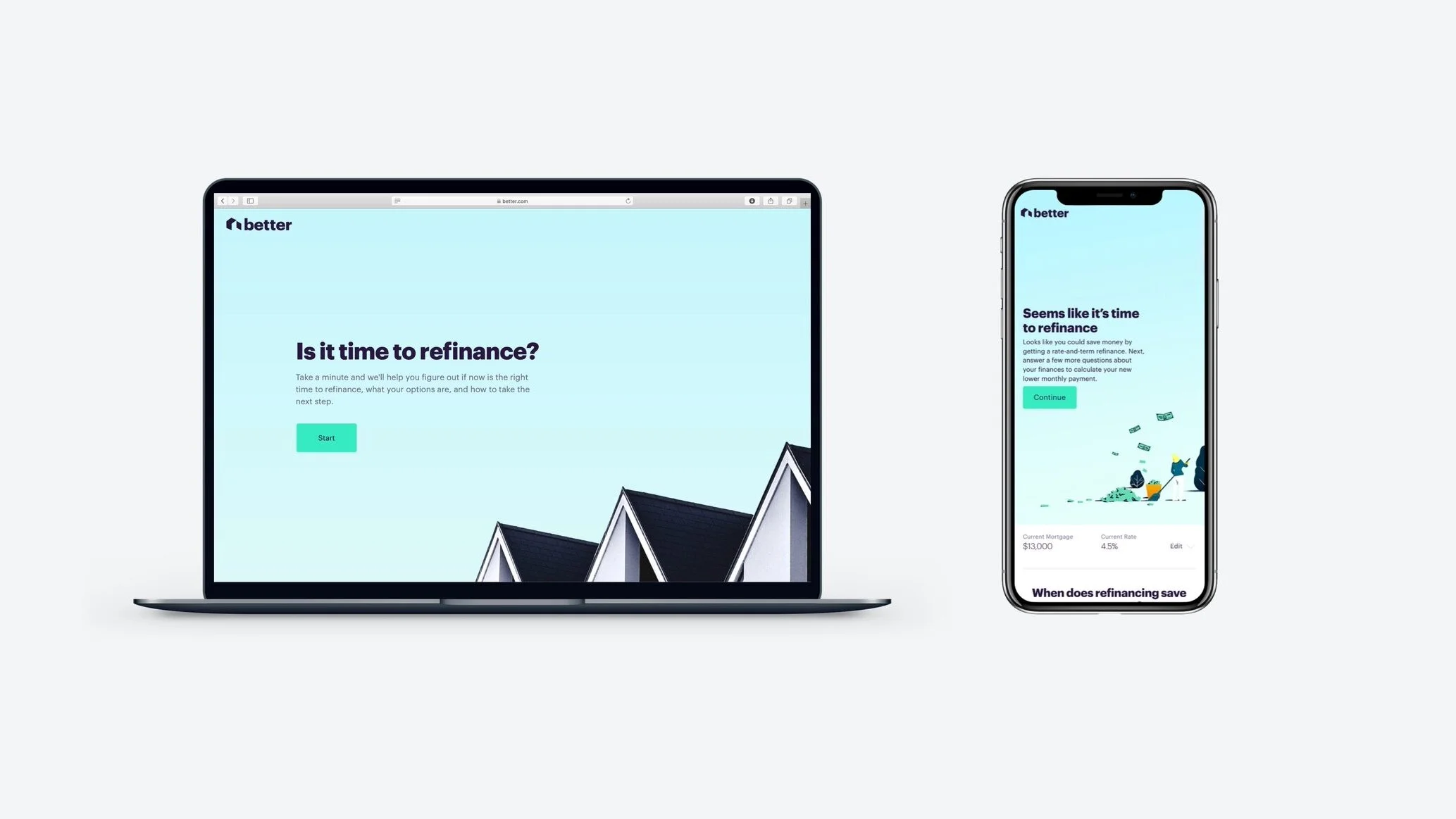
The results page was dynamic, and if we were advising a user to refinance, we emphasized their next step. We populated different articles, calculators, and vocabulary based on the user’s responses. If a high intent user—someone who responded that they were ready to refinance tomorrow—got to the end of the page and still hadn’t proceeded with the next step, we displayed one of our friendly loan consultants’ faces, as well as a CTA to call or schedule a conversation depending on time of day.
Refining mobile
We wanted the mobile experience to feel lightweight, so we relied mainly on a series of one-click interactions.
In the desktop experience, we populate the background as the user responds to each question. While on desktop it served as an incentive to keep going, the mobile counterpart just felt distracting. We wanted the user to focus on the question only.


The results
We were able to get more people to start an application for half the price at a time when refinance rates were going up!
We learned in testing that users often wanted to try out multiple scenarios, so in the final version we added a way to edit responses on the results page.
Additional case studies

Winning trust through the Pillar payment interface
Explore the interface choices we made to gain our users’ trust >

Using emotion to connect with student loan borrowers
Find out why paying loans off faster wasn’t resonating with the typical debt holder >

How my team got internal buy-in to streamline onboarding
Learn more about how we broke down barriers between departments to do what’s best for the user >
